HRM system
punch card and apply for leave conveniently
HRM system
Problem & Solution
In 2016, the population of mobile users was greater than PCs. The latest figures
show that the number of smartphone users continues to increase year after year.
In 2021, the number of global smartphone users is estimated to be 6.4 billion, marking a 5.3% annual increase over
2020.
(https://www.oberlo.com/statistics/how-many-people-have-smartphones)
Therefore, employees should not have a problem integrating into an HRM system
app.
Instead of a traditional punch card machine and a complex PC system, this HRM system app will simplify office processes for employees. Using this app not only saves papers from punch cards but also saves costs from human resources.
user insight
“As a remote work employee, I would like to spend less time on dealing with complicated processes.”
“I don’t want to waste time waiting in line to punch my card. And if I have to wait too long, it could affect my attendance, which would have an impact on my bonus.”
Inspiration
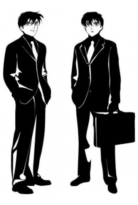
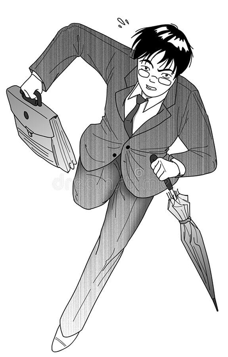
Most employees that would use this app are millennials from Taiwan who are likely fond of the Japanese graphic novels called "mangas". The inspiration for the illustrations in my design was therefore chosen to appeal to this group of people.
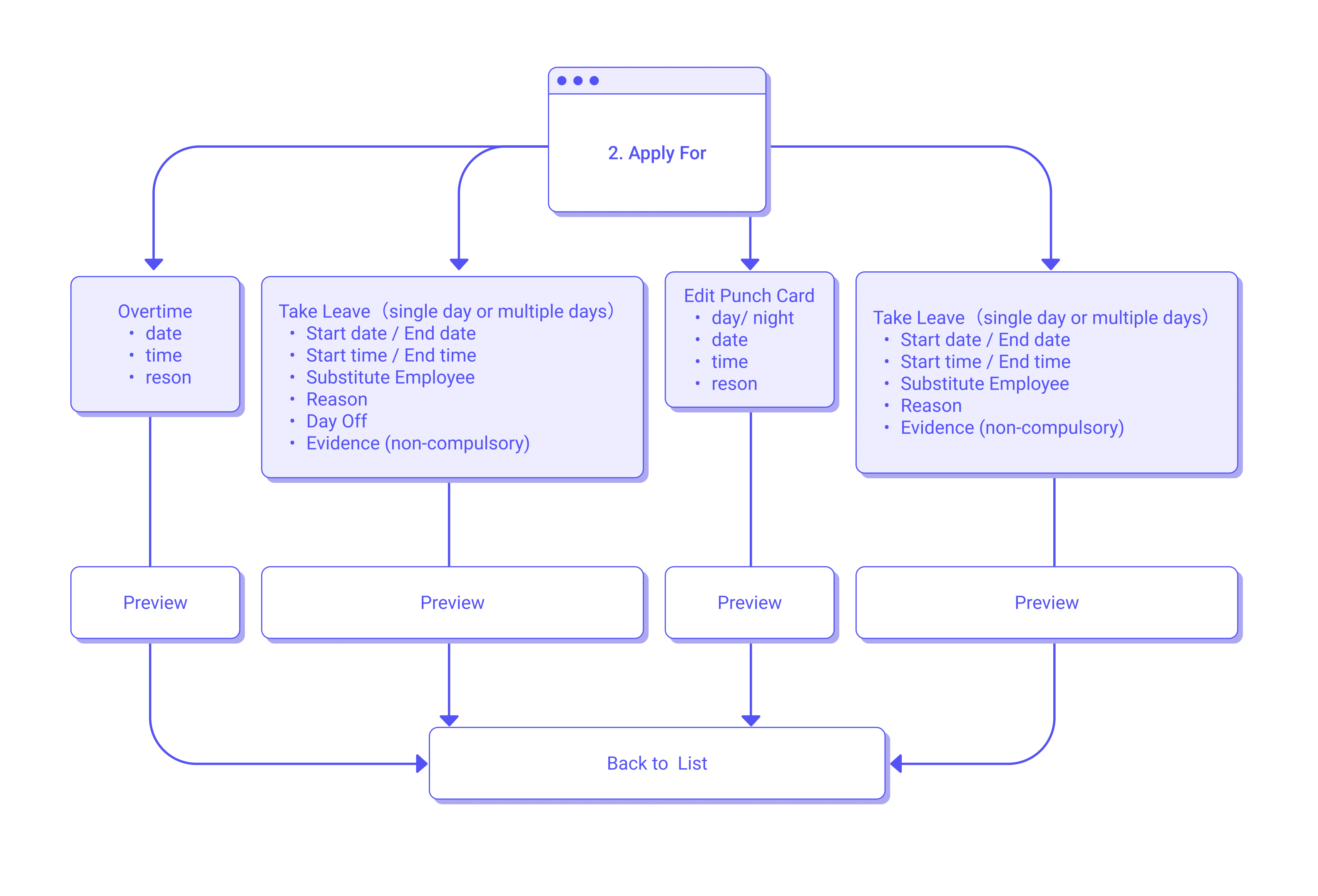
Wireframe
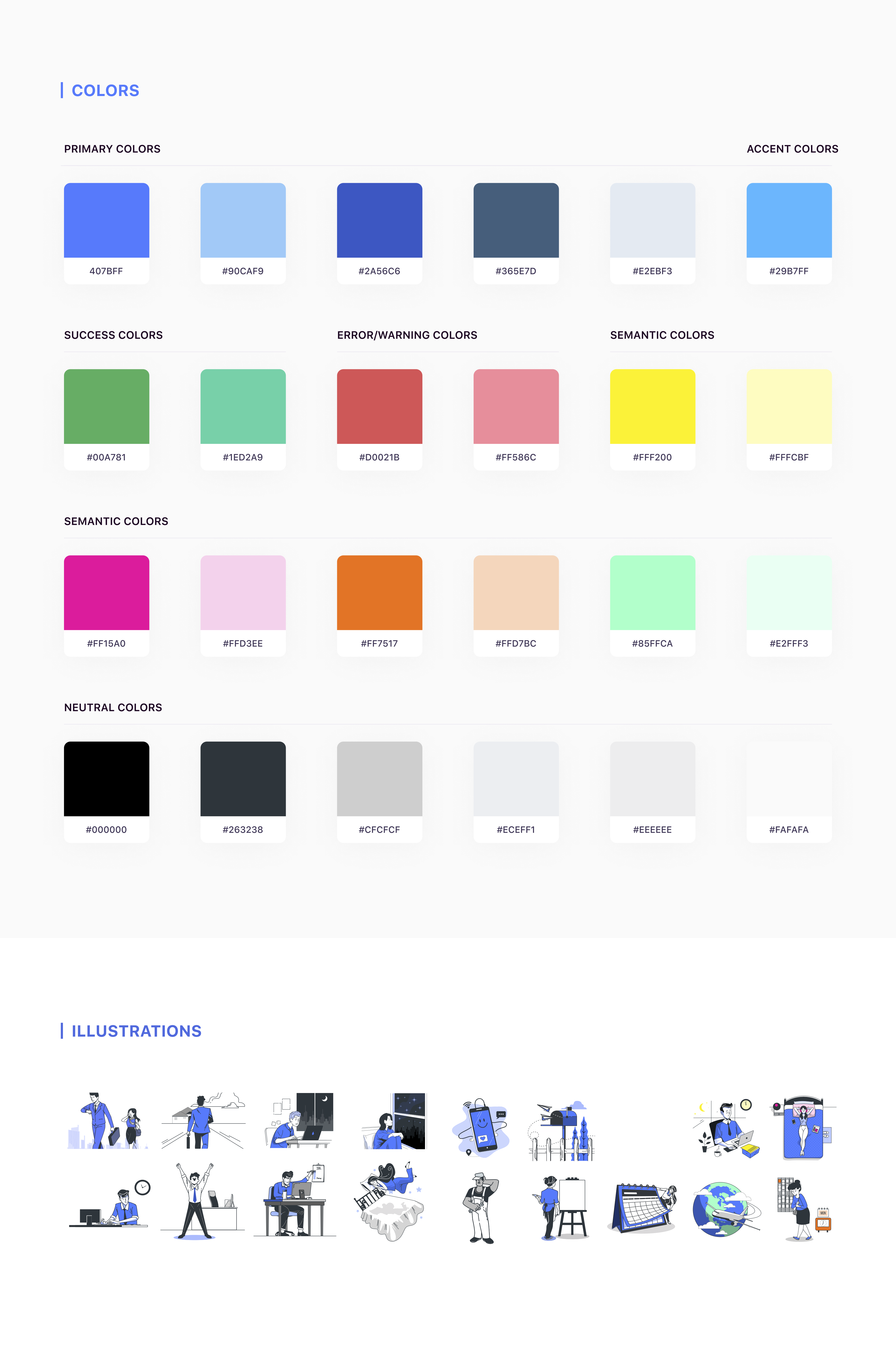
Design Guide
▾ android's system
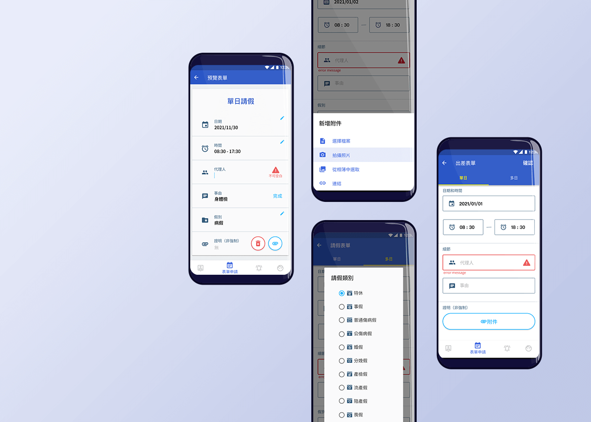
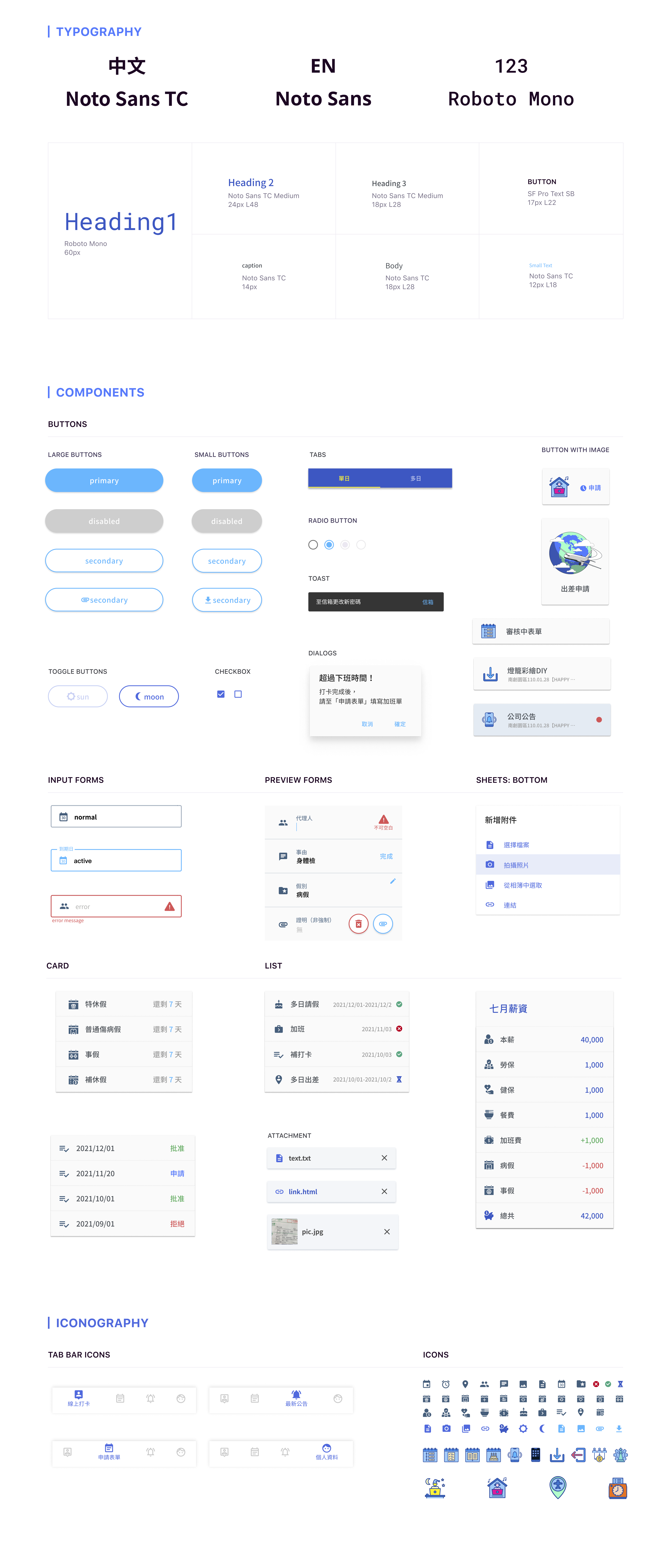
At first, I designed the square buttons for the Android system; however, when android 12 beta was released, I noticed the latest design trend; therefore, I changed the original button design to the rounded corner.
Icon
There are two icon design systems for different users' behaviors. I followed google material icons to create similar styles as android leave icons.
▾ Leave and payment relevant icons
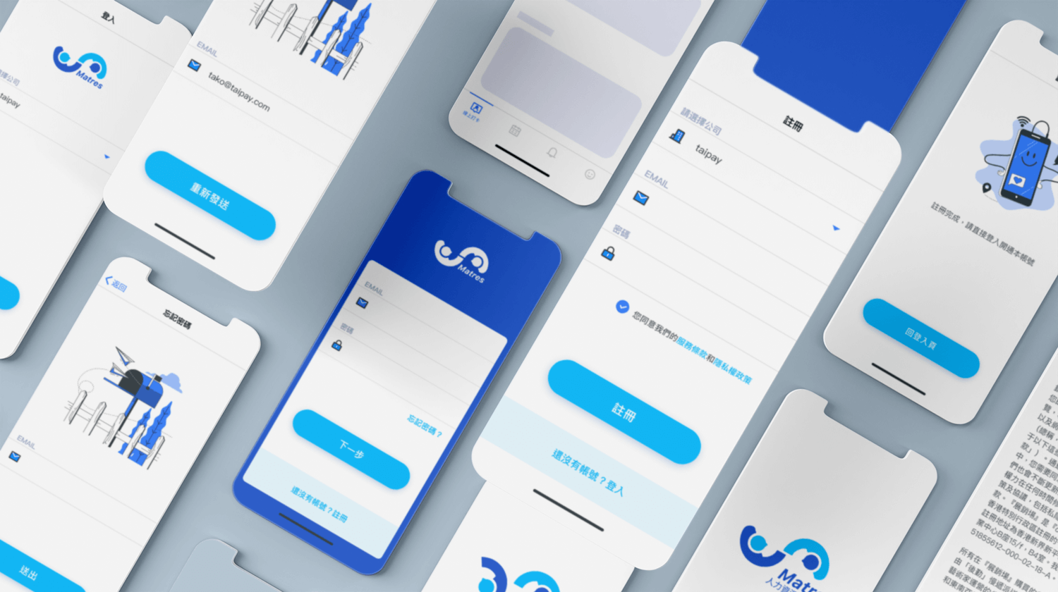
Sign Up and Log In
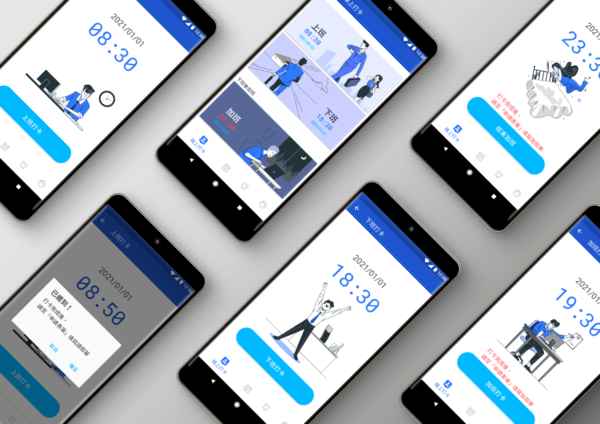
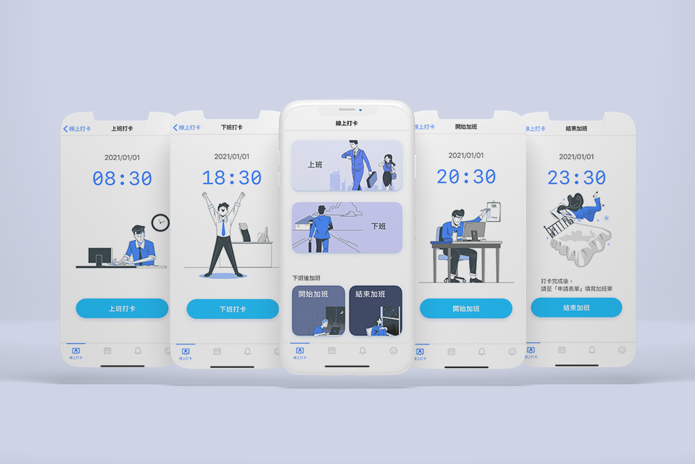
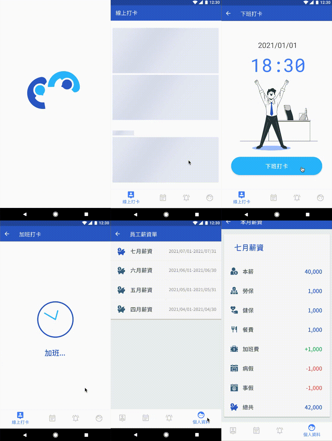
Punch Card
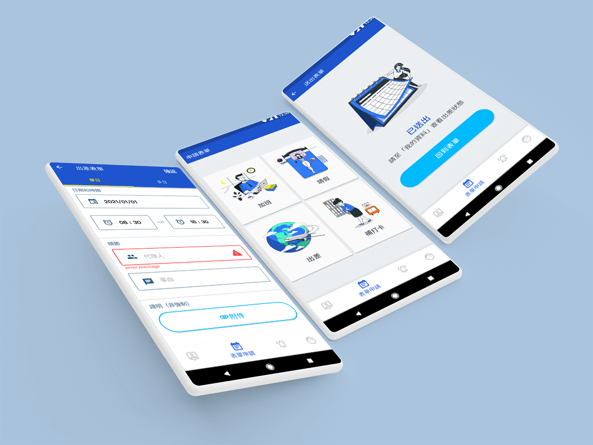
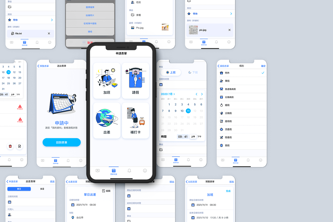
Apply for form
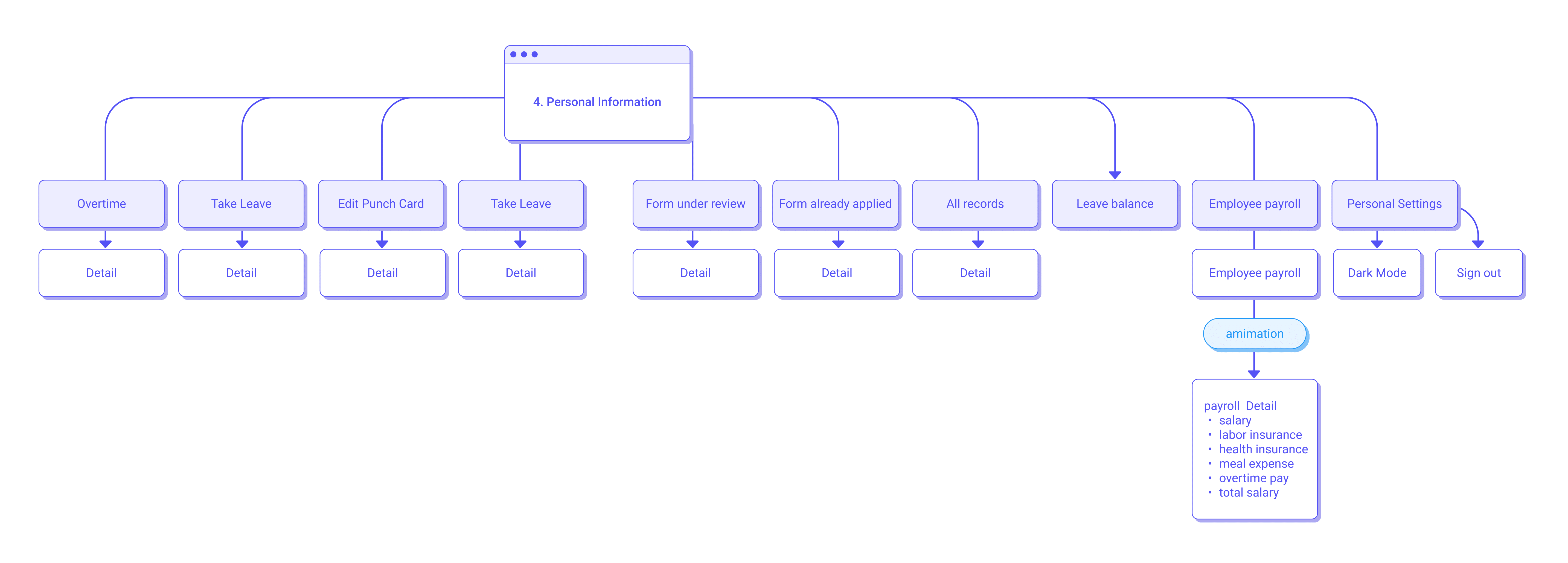
Personal info
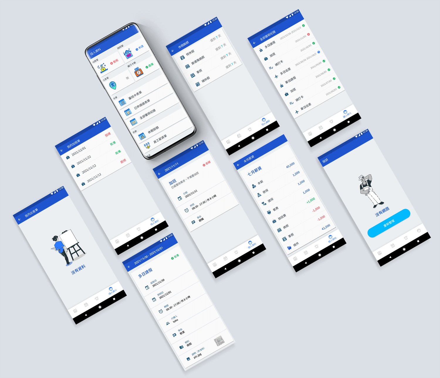
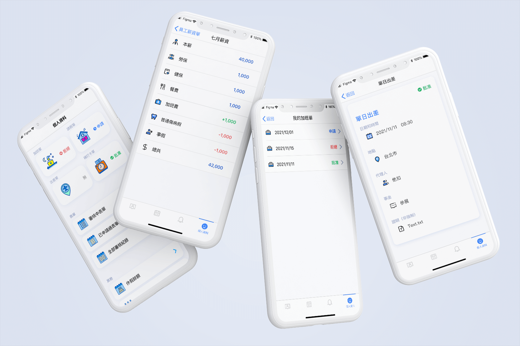
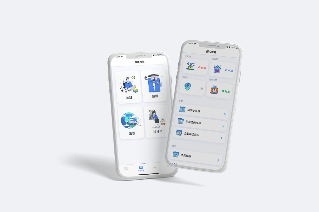
Moreover, I chose the same color of graphics and icons for consistency. ("apply for form" that matches "personal information")
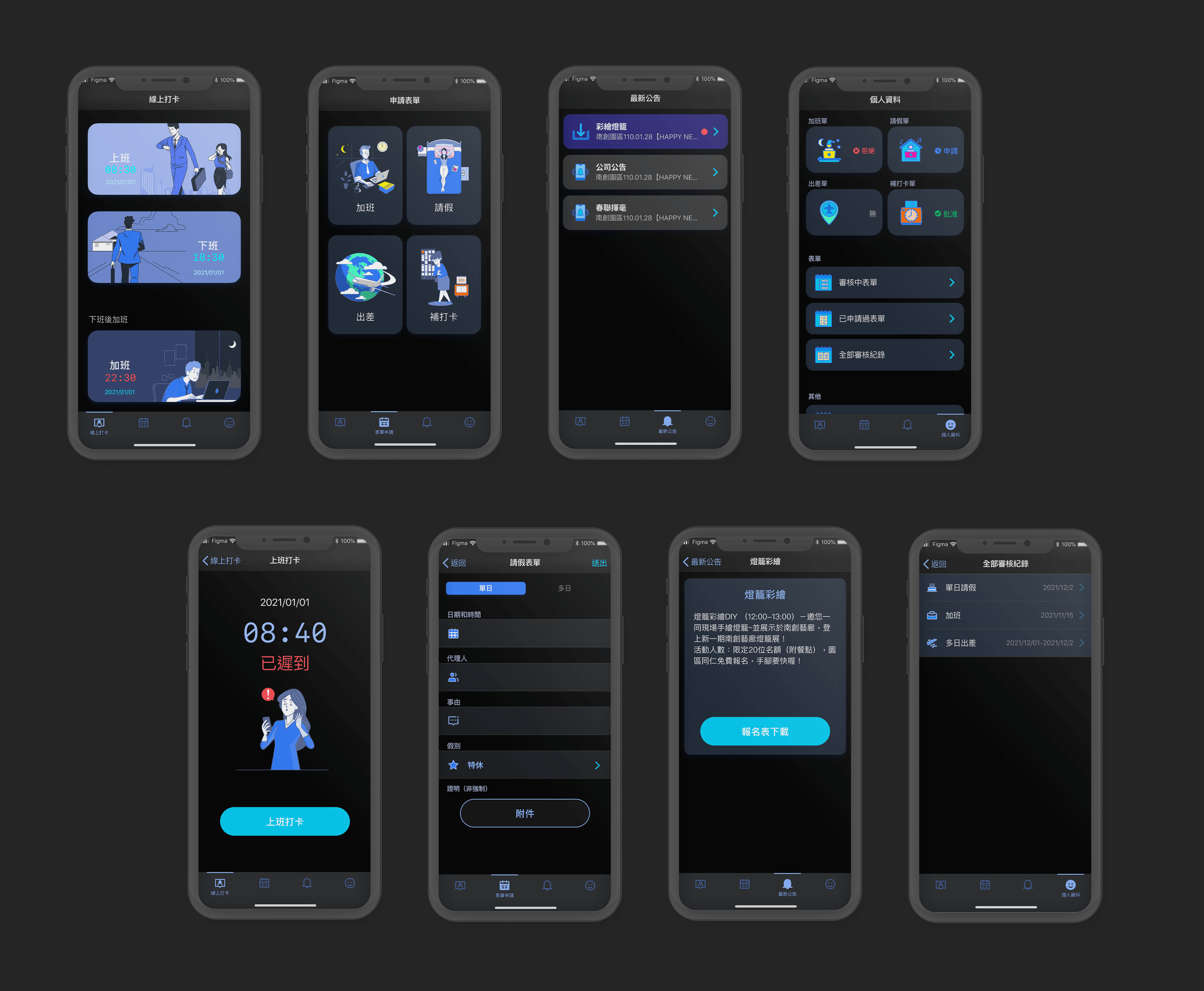
Dark Mode
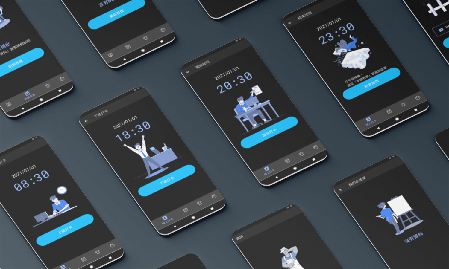
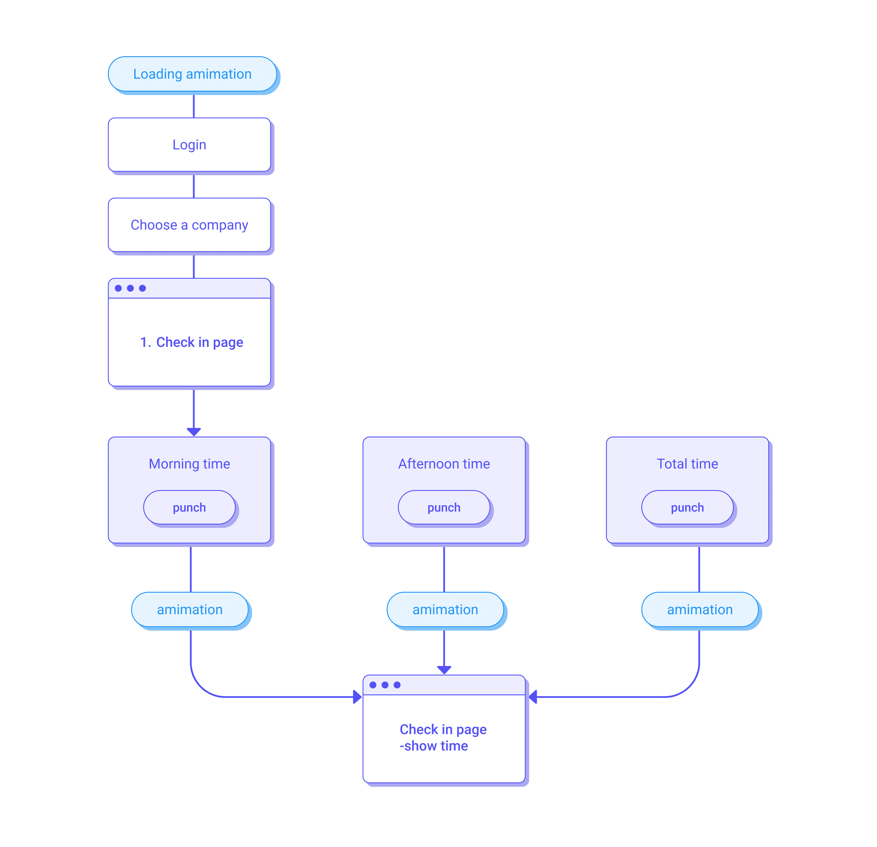
This project is one of the products in the "HR Management System." I am responsible for it is the visual interface and screen flow of the entire app. I think the webpage(RWD) and the app must be separated, so I recommended the "frequency" used by the staff. Therefore, "punching a time card" and "asking for leave" are the main functions. Compared with the webpage, the information presentation- simple flow and large buttons of the app are more intuitive for users.
UI
UX
